1
Moodboard first
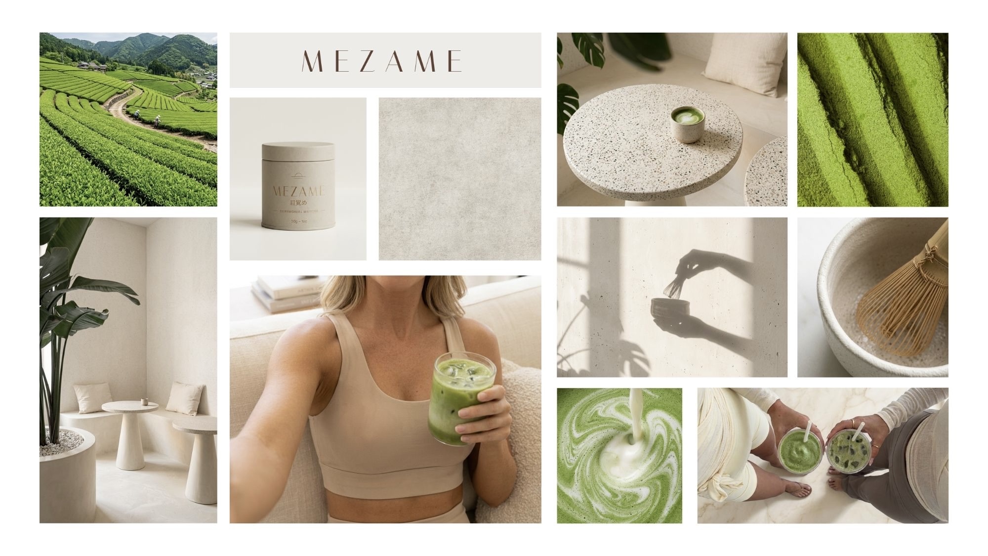
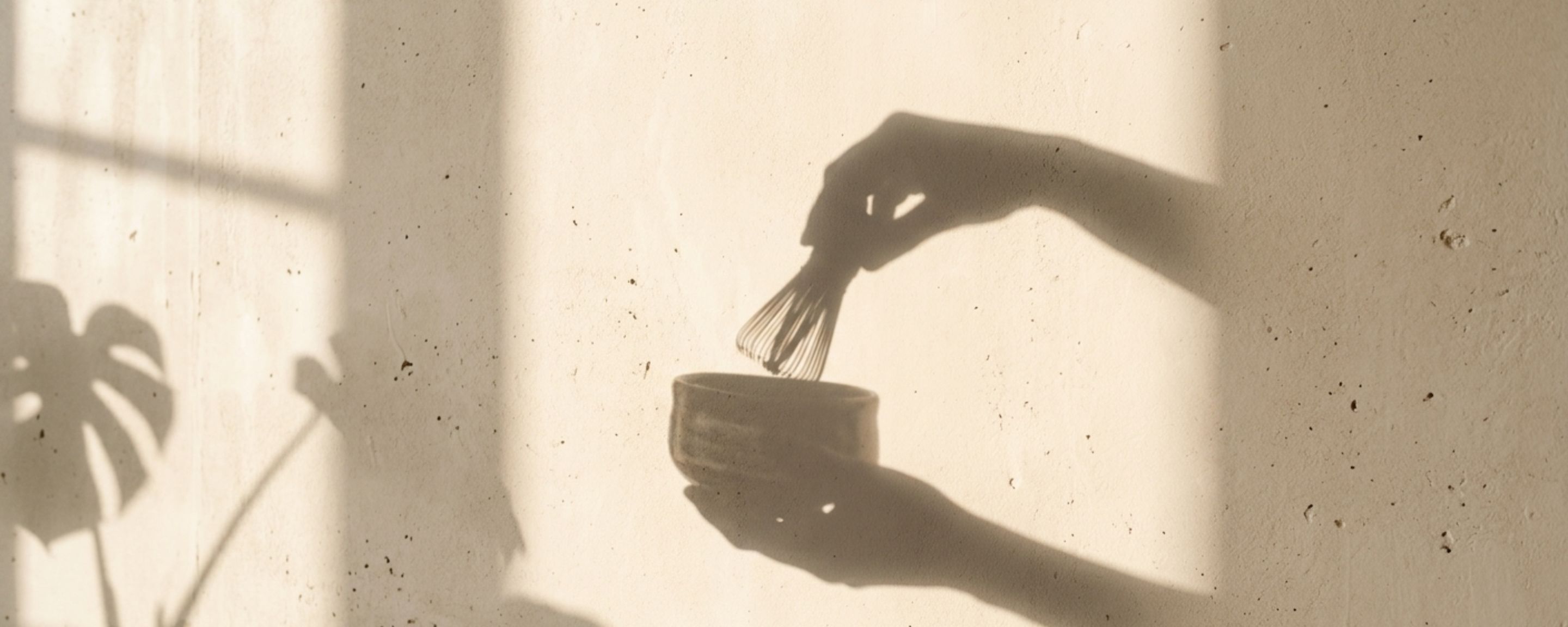
Before a single product image: the mood, the light and the places where this matcha lives. Quiet interiors, tea fields, hands and shadows.
Most matcha brands look the same: bright green powder, bamboo, a hint of Japan and a lot of energy.
MEZAME means to awaken, and it is meant for slow mornings rather than busy ones. So the idea was to take the volume down: warm stone, soft shadows, one calm green and a ritual that asks you to be present.
The goal was a visual world that stays recognisable whether you meet the brand on a café shelf, in a feed or on its own website.
Before a single product image: the mood, the light and the places where this matcha lives. Quiet interiors, tea fields, hands and shadows.
One matcha green, carried by warm neutrals and real materials: terrazzo, plaster and wood. The green only appears where the product is.




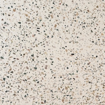

Every future image fits one of four pillars: the product, the ritual, the texture and the everyday moment. That is what keeps a growing library consistent.
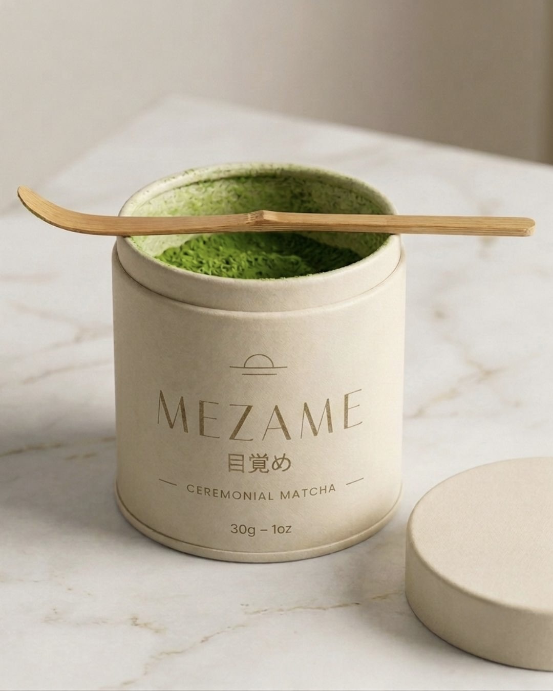
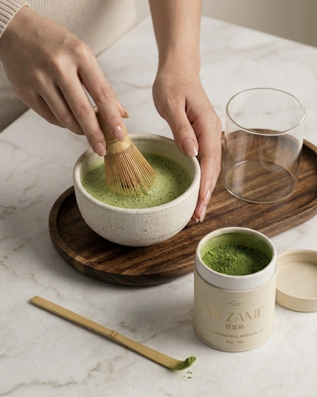
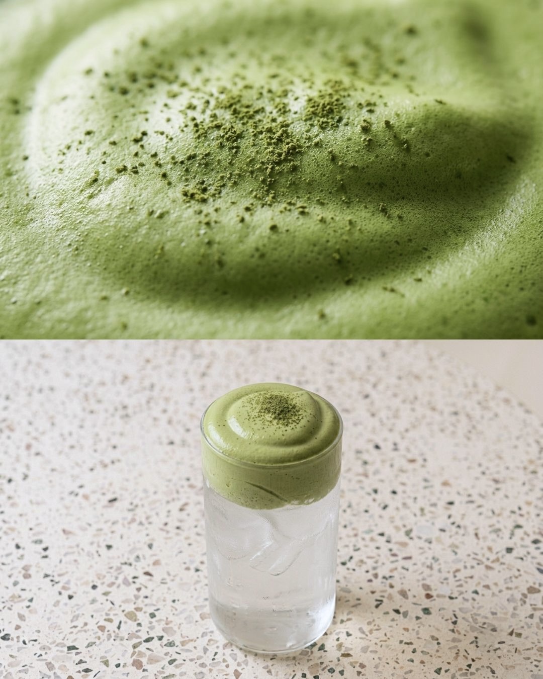
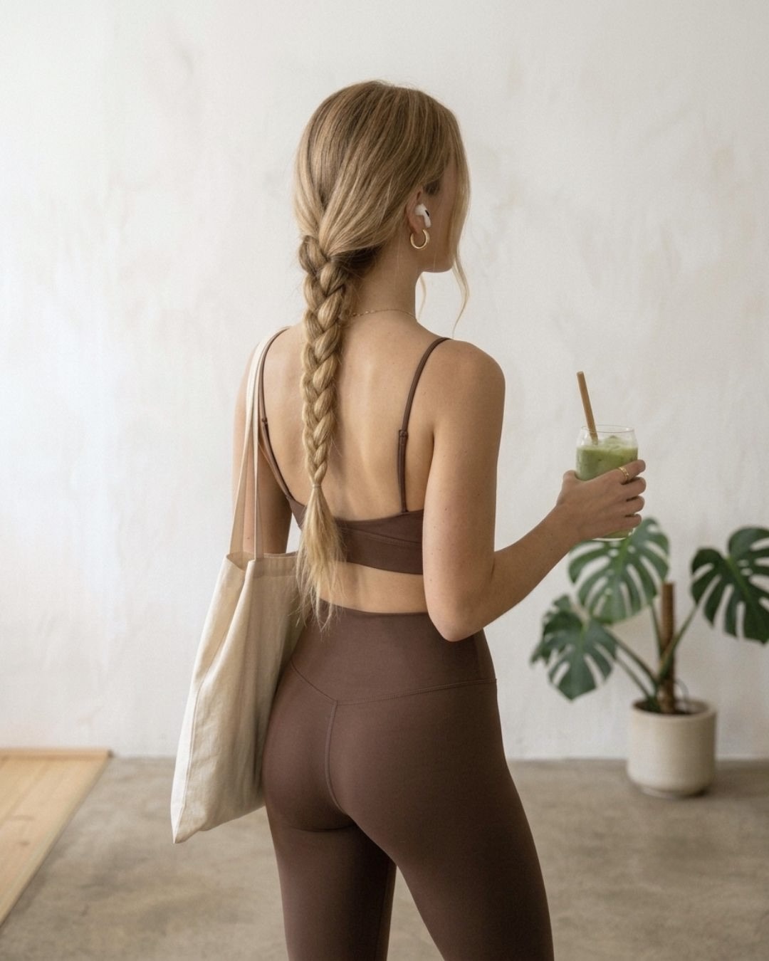
The system went live as an editorial brand page: origin, ritual, the tin and where to find it, paced like a slow morning.
Visit the MEZAME page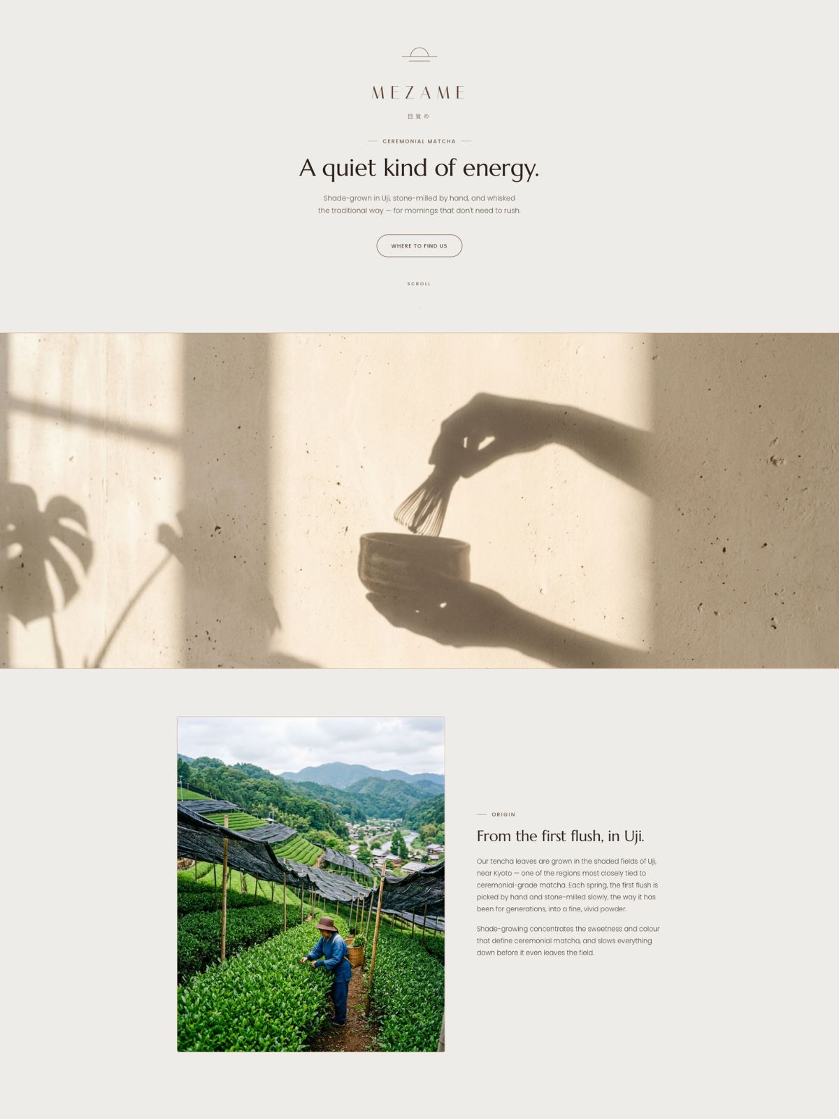
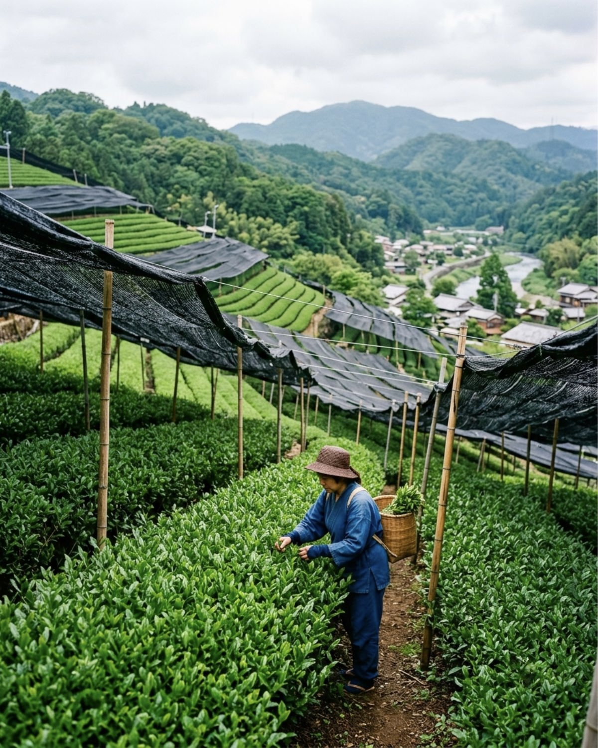
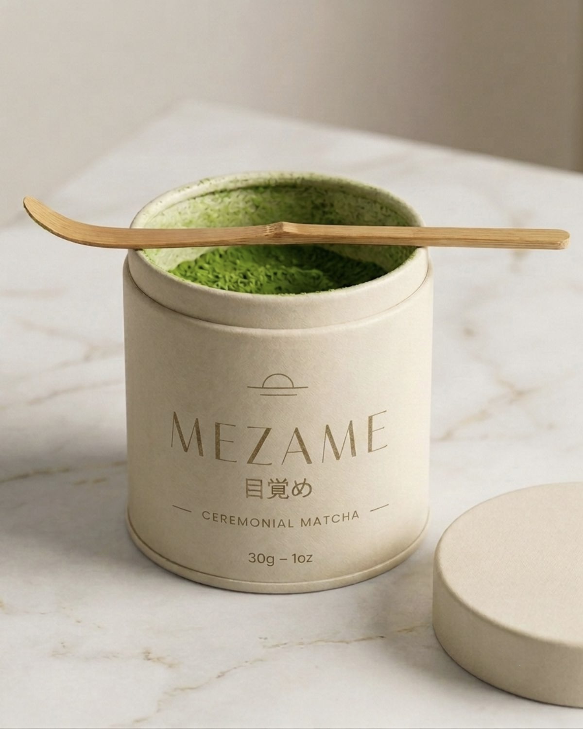
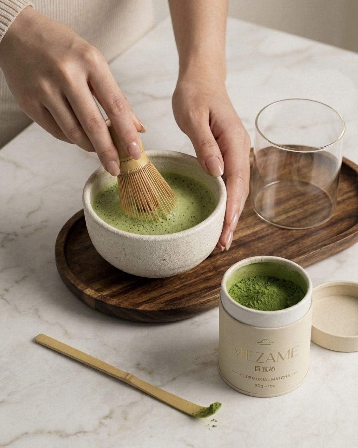
same world, every image
MEZAME is a self-initiated concept brand. All images are AI-assisted and art-directed by Mihara Studio.
Next brand
M Eyewear
From one plain product photo to a full summer campaign. Story coming soon.